
New Orleans Pelicans reveal new uniforms
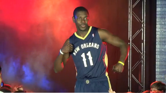
Jrue Holiday wearing the New Orleans Pelicans new away uniform
The New Orleans Pelicans, in following with the announcement of their team name as a fairly harmless and little-beloved bird, today revealed the uniforms they will wear in their debut season under the new moniker. Similarly to the naming announcement, the uniform-reveal was met with reactions of underwhelment by many.
N’awlins has gone for a minimalist, “classic” look, which many have derided on social media as being too boring, for such a flavorsome city. The biggest qualm seems to be with the size of the typeface on the front of the jerseys.
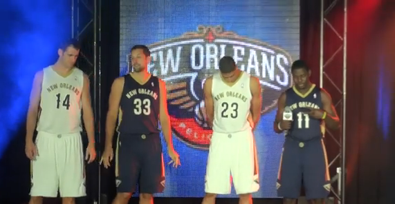
Jason Smith, Ryan Anderson, Anthony Davis and Jrue Holiday model the unis
On their website, the Pelicans have indicated that the uniform design is a nod to history:
As New Orleans Pelicans logo and uniform designer Rodney Richardson puts it, the city of New Orleans is frequently depicted nationally as “an over-the-top caricature.” That often results from TV coverage that broadcasts snippets of Mardi Gras for example, which publicize some of the more childish aspects of the annual celebration.
When Richardson envisioned what he wanted the uniforms for the New Orleans Pelicans to look like, he hoped to move far away from the Crescent City’s cartoonish portrayals. The result is a classic, clean-looking pair of navy blue and white uniforms.
The Pelicans also revealed that next Summer they will unveil a third, alternate uniform.
The away uniforms look incredibly similar to a Memphis Grizzlies uniform in my eyes, and the home uniforms do look quite NBA-Summer-League-like. However, any time a team goes for a classic look, I’m willing to give them cred points. This strip is definitely an upgrade on the old New Orleans Hornets look, in my opinion. One thing the NBA has over most sporting leagues in the world is the lack of sponsorship logos clouding their jersey design. This simple styling that the Pelicans have chosen to utilize, certainly takes advantage of that lack of clutter.
Check out video of the unveil here.
What do you think of the new Pelicans unis? Comment away…


