Examples of Bad Logo Design
A logo can make or break an organization. A good logo will enhance its brand whilst a terrible logo might be all it takes for an organization to achieve internet infamy. Let’s check out some really examples of bad logo design.
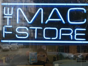
The Mac Store
Who would have thought that the word “THE” would read “WTF” when put sideways. Turns out “The Mac Store” did. WTF, Mac Store, WTF.
Junior Jazz Dance Class
I don’t know what is worse, the fact that they think Hip Hop is for boys only or the logo. The logo gave me a chuckle. How did they not see that or was it just a case of having no money to fix it?
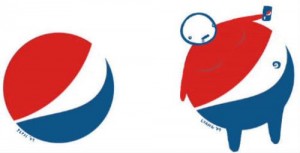
Pepsi
Here is a case of stylized art imitating stylized life.Drink too much and you may very well start looking like the logo. The Pepsi logo, not Jerry West. Speaking of basketball. I liked the Pepsi logo better when it looked like a basketball keyway circle.
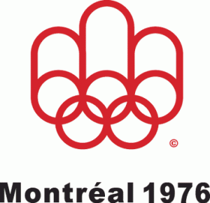
Montreal Olympic Games
In 1976, Montreal committed effectively flipped the whole world the bird. Props to you, Montreal. Much props.
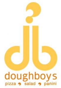
Dough Boys
Watch out, guys. Pizza, salad and panini, all at Dough boys. Don’t let the question mark fool you. They boys seem pretty proud of their phallic dough concoction.
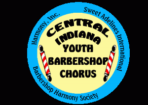
Central Indiana Youth Barbershop Chorus
It is fitting the Central Indiana Youth Barbershop Chorus has a logo that looks like it was designed by a youth and even then, the only chorus this barbershop sings is “Eeeeew”!.
Locum
This Swedish Property Management company didn’t even resort to subliminal messaging.
Craze Agency
this ‘talent’ agency looks like it was created in MS Paint. Imagine how terrible the logo ideas they passed up must have been. Put it this way. If this agency thinks that this logo is good, imagine how terrible their actors and actresses are.


